ILLUSTRATOR PETE WALLBANK here discusses his work on the 1998 release of Survivors series one by Sovereign Video; and his artistic contribution to the label's ultimately doomed plans for a series two release the following year.
You've enjoyed a long and varied career as a commercial artist and illustrator, at what point did you become interested in the field of film and television illustration?
That's a tough question. I went through a period in the 1980s, my early teenage years, when I absolutely loved Doctor Who. Peter Davison, as I remember, was The Doctor. It was around this time I was getting interested in drawing and art full-stop.
Were there other artists and illustrations who helped to inspire your interest?
Yes. As I remember there was an illustrator by the name of Andrew Skilleter who at the time was creating the art for the then Doctor Who novel covers. I was particularly attracted to his work, not only because it was connected to something I was interested in but also from a creative point of view - design, colour and so on - along with the portrayal of established characters.
Were you a fan of the sci-fi, fantasy and cult genres before you become involved in this area professionally?
As I said previously, I had gone through a period of loving Doctor Who. Prior to that, as a kid I had watched the Anderson stuff and occasionally was allowed to watch Hammer horror films. I also loved the Universal horror films - a lot of the time it depended upon what was on and when it was on!
My first professional work of this kind was the work I created for the Doctor Who book range
Pete Wallbank
We only had one TV in the house and naturally Mum and Dad ruled the roost as to viewing preferences. Neither of them liked sci-fi or fantasy, so watching Blake's 7, Sapphire and Steel and so on was a big no-no! I do remember as a lad absolutely adoring The Six Million Dollar Man.
You're perhaps best known by genre enthusiasts for your work on video cover illustrations. What were your first commissions of this type and how did they come about?
I suppose my first professional work of this kind was the work I created for the Doctor Who book range. My first work of that nature was commissioned in 1989 - a Tom Baker cover as I recall, the book being The Pescatons. The book was a novelisation of the first ever Doctor Who audio adventure, released on LP and cassette in 1976, written by the original scriptwriter Victor Pemberton and published by Target in 1991. The artwork also featured on the Silva Screen CD version of The Pescatons which was released the same year.
For you, which examples of your early work in this area stand out and why?
Probably my attempts to do 'grown-up' Doctor Who work! Without a shadow of a doubt, by the end of its time, Doctor Who had in my opinion got very silly.
In certain pieces I'd been asked to do, I had tried to give a more 'adult' feel to the work and concepts behind it; for example, showing the then-girl assistant being turned into a 'cyber-girl'! The truth be told, I just wanted to paint Peri with little on aside from a cybernetic bikini!
Was Survivors a programme that you were aware of? Were you a fan of the series beforehand?
I was aware of Survivors being on, but again it's not a show I would have seen because of (a) having only one telly, and (b) Mum and Dad not buying in to this kind of show.
Had you been aware of (or even bought) the original BBC Video release of the first series of Survivors in 1993? Had there ever been the possibility of you securing the design commission for that earlier release?
Having worked on various projects and products for BBC Video, I was of course aware of the initial release of Survivors on VHS. I don't think there was ever a chance of me being asked to do those early covers, as I believe the BBC would have insisted on those covers being strictly photographic.
How did you secure the commission from Sovereign Video to work on their video re-release of the first series of Survivors?
I had worked with the managing director of Sovereign Video, Steve Haynes, previously at his old company Encore Entertainment. Sovereign was his new label. My initial work with him was on a film title called The Disappearance of Flight 412 starring David 'Hutch' Soul - an X-Files-type thriller.
How much direction did they give you about the nature of the design that they were looking for? Were they quite prescriptive, or did they leave things more open to your discretion?
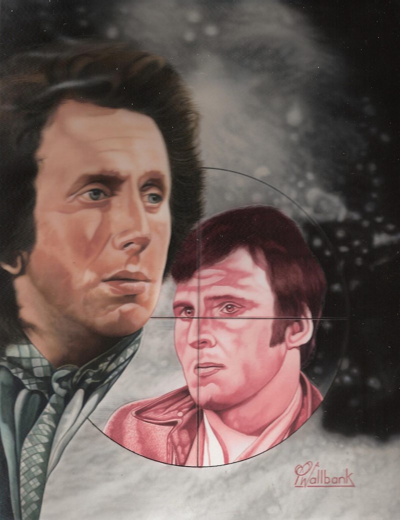
I think they certainly wanted to create a strong overall theme: a main character and secondary character or element at the centre of the sleeve design. But beyond that, I was pretty much allowed to get on with it. What was not flexible was the issue of deadlines: targets had to be hit at very short notice, with very tight lead times.
Did you make a conscious decision to distinguish your design from the earlier BBC video release (which was, of course, photographic based), or did you simply start afresh without reference to it?
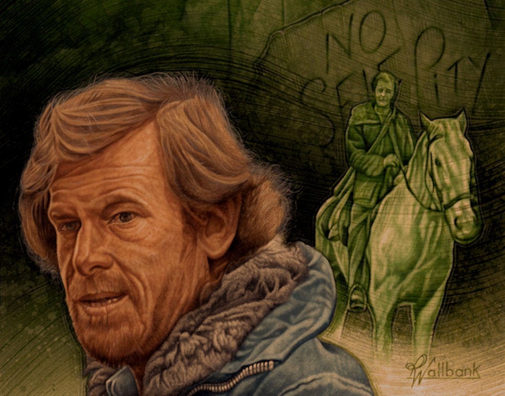
I very much wanted to start afresh. I tried really hard, within the constraints imposed by the lack of time, to give the sleeves a 'fully-illustrated' look. I wanted to link all the sleeves in the series together by using the virus background as a running motif.
Did you watch (or watch again) the entire of the series with an eye to the sleeve design possibilities, or was that not necessary? Often the episodes included on a single tape were quite diverse - did that raise any particular design challenges?
I did watch the episodes. It was the obvious way to get a good sense of what I needed to feature in terms of characters and dramatic themes. That said, Sovereign themselves usually held a clear idea as to which character should feature in the main portrait on the sleeve.
There was just so little time - certainly not enough for any false starts or second chances
Pete Wallbank
How long did it take to settle on the core components of the sleeve design - the background image; the use of a prominent single character to the left; and a secondary character or image to the right? Was it a case of experimenting with a range of designs, or did you fix on that approach from the off?
As I remember it, we had a 'brief' as to what we were aiming for with the covers overall - and then we hit the ground running. There was just so little time - certainly not enough for any false starts or second chances. A 'rough' was produced for the spine and cover number one (the first of the six needed for the set) and we were away.
How and when did you hit upon the idea of the skull motif for the video spine? Do you think that that added a valuable extra dimension to the design?
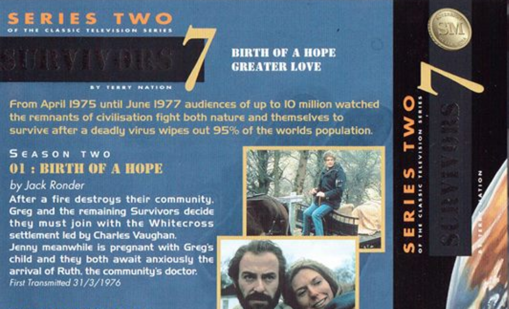
Sovereign asked for a bridging illustration for the spine. I came up with the idea of representing The Death in the image of a skull shrouded in the virus that had all but wiped out human kind. Originally the skull was to have eyes - which perhaps would have made the design stand out even further when the cases were stacked together!
These videos were released during the course of 1998. How much of a lead-time did that give you to complete the work? Did the pressure of deadlines loom?
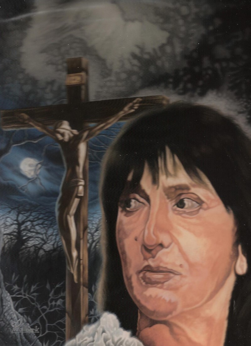
It was crazy! Some of those covers were produced in less than 10 hours from start to finish. The sleeve illustrations for the first two videos - Volume 1, featuring Abby and Volume 2, featuring Greg - and the spine design were all delivered to Sovereign together in one batch.
The very first image to be created was the skull design for the spine. I then intended to concentrate on The Fourth Horseman and Genesis sleeve, which had to be delivered on the Wednesday of that week. On the Tuesday I was told that Sovereign would also need Volume 2 - Gone Away and Corn Dolly - the next day as well. The midnight oil was definitely burnt in the creation of the sleeve for Volume 2, I can tell you.
Can you say something about the creative and technical processes involved in completing the six designs?
Invariably, thing would start by me getting sent a tape of the episodes involved. As is usual there would be no other reference material to hand.
Typically, I would use video 'screen grabs' to create still reference images from which to work. This is always fraught with difficulty, as the image always loses an incredible amount of detail as you take images in this way. Once I had all my reference images together, I would then set about creating a draft drawing to show to the client. Once that was approved, I could then move on to creating the finished painting.
I would create the image at one half-size larger than the finished version - for reasons of speed. For materials I would use acrylic and gouache paints, and work on a 220gsm cartridge surface.
Was Sovereign pleased with the finished results?
I think so, given the tight constraints of time. I know that there was some encouraging feedback from some retail outlets about the presentation and design of the release.
Were you happy with the way that your illustrations were incorporated into the finished Survivors sleeve design?
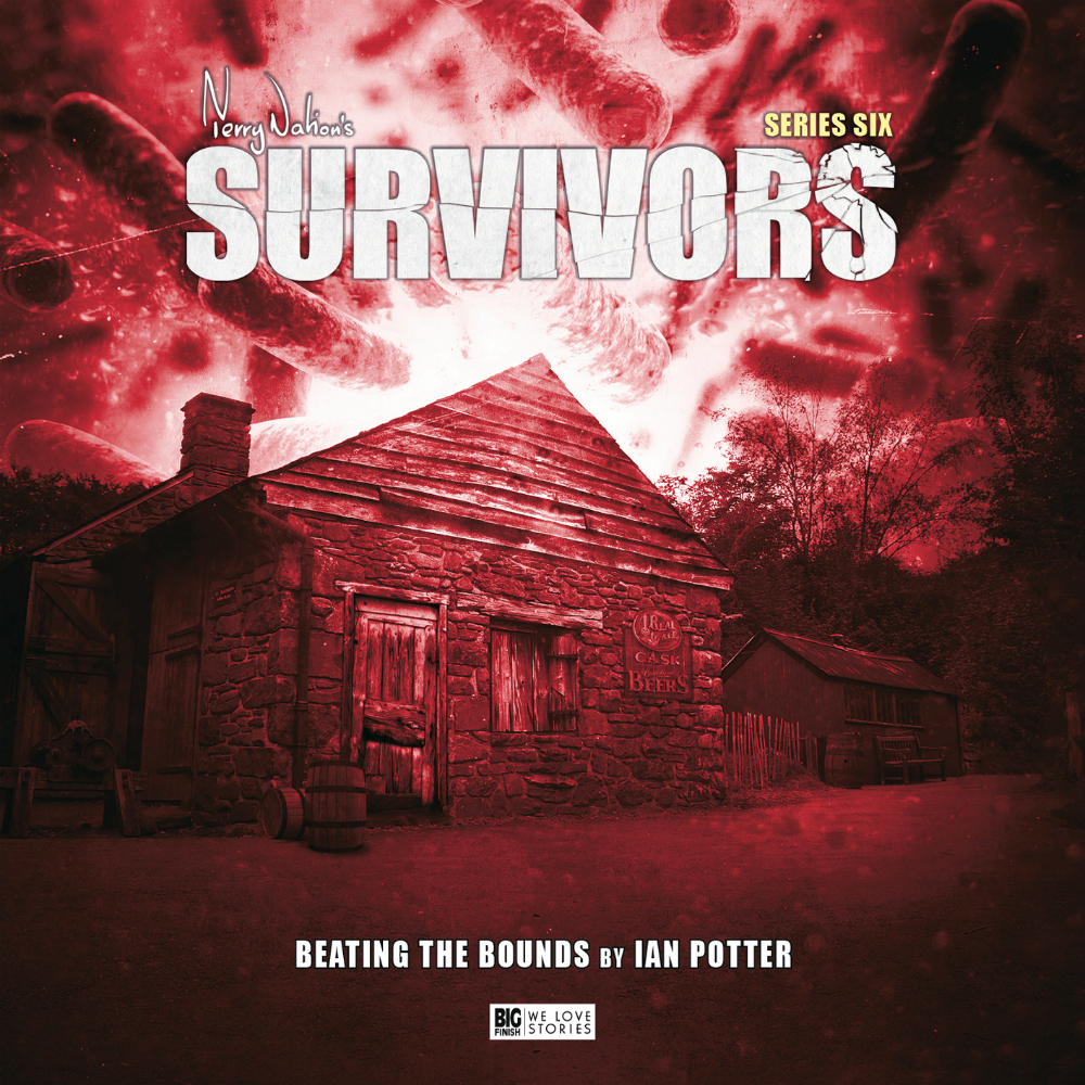
I was disappointed that Sovereign either chose not to, or didn't feel able to, use the correct Survivors logo and font. The print reproduction of the sleeve itself also left a lot to be desired, and could have been significantly better.
It was probably around the March of 1999 that it became clear that something was amiss
Pete Wallbank
How soon after did you receive what would prove to be a fateful commission to work on Sovereign's release of the second series of Survivors?
If memory serves, it was in the summer of 1998 that I was given the go-ahead to begin work on the Survivors series two release.
Were there any differences to the way in which you approached this second Survivors commission?
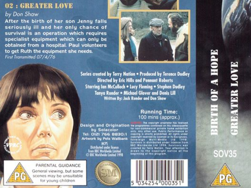
The general guidance from Sovereign was to broadly follow the template established in the first series' release. What would distinguish the series two sleeves is that these new illustrations were to be entirely in colour, and not in tones of red in parts.
Your finished work on the second series Survivors VHS release appeared in genre TV advertisements for the release, and all six designs appeared as illustrations for (what proved to be premature) SFX magazine reviews. When did you come to realise that there was a problem with the release itself?
It was probably around the March of 1999 that it became clear that something was amiss. We'd waited and waited, and nothing appeared to be happening. You start to pick up a sense when something is not going to happen.
Sovereign did try and get the project back on track later on in that year. A six-tape box-set of series two was proposed, and I was asked to design a wraparound cover for the box. I completed the design for this, but that's as far as it got.
When and how did it become apparent that this second batch of tapes would, in fact, never see the light of day? How disappointed were you with the news?
I was not that disappointed, really. Working within the creative industry you get used to a fair share of setbacks; it's just par for the course. As a commercial artist I have to rationalise it by saying to myself that I was paid for the work. The second set of covers was also, to my mind, an improvement on the first. I'd had a little more time to work on them.
Had you been intending to work on any of the future VHS releases that Sovereign had been publicising - including Doomwatch?
Yes, as I recall. There were a couple of titles that I had already geared myself up to do. One was an Avengers documentary, and another was a similar project about the 1962 film The Time Machine.
Since then, what have you chosen to do with your twelve pieces of Survivors sleeve artwork?
I would have welcomed having more time in which to complete the work, particularly on series one
Pete Wallbank
I have been fortunate that Survivors is blessed with an enthusiastic following. Most of the original sleeve designs are in the hands of people who love the show. This in itself has been a big honour for me - and I thank those fans for their encouragement and support.
Looking back on your work on the Survivors release - with the benefit of hindsight, and without any of the pressures of deadlines - is there anything that you would have done differently, or liked to have been able to change?
Well, I would certainly have had Sovereign change the logo and adopt the correct Survivors typeface. The print reproduction of the sleeve should also have been of a higher quality. I would also have welcomed having more time in which to complete the work, particularly on the series one release. Of course, all of these were issues outside of my control - and it's typically like that for the artist in this field of work.
Has the explosion of the DVD market over the last ten years impacted on the kinds of genre work that you have been approached to do?
It has certainly changed things. What has happened through the spread of DVD is that film and TV series from earlier eras are now accessible to new generations. As a by-product of this process, I have seen additional interest generated in my own work, and for that I am extremely grateful.
What are some of the highlights of your creative projects from the last decade, and what sorts of things are you planning to focus on in future?
The biggest highlight, and the single most significant achievement, is the fact that I've been able to keep working at something that I enjoy. I'd had a very privileged life as far as my work goes. It has opened up some new adventures and opportunities and allowed me to meet the most amazing people.
I am by profession a commercial artist, whose work has to range across a broad spectrum. I am delighted to be able to keep working and to honour what I help bring to life through what I do.
Pete Wallbank was interviewed by Rich Cross in October 2007
Cite this web page
Cross, R. (2021). 'Interview: Pete Wallbank,' [online] Survivors: A World Away, 31 January. Available at: https://www.survivors-mad-dog.org.uk/a-world-away/Interview_Pete_Wallbank.php. Accessed on: 27 April 2026.
Current style: Harvard
TAGS
